Tuesday, 26 November 2013

2000AD Portfolio Copetition

As mentioned in a previous post I attended the Thought Bubble 2013 convention. One of the highlights and the main reason for attending the festival was the 2000AD portfolio competition. 2000AD provide a sample script, found here, and all entrants have to create artwork based on the 4 page script. On the first day of the convention the entrants work is assessed and 6 entrants are selected to go before the judges. The following day a review panel is held in front of an audience and the work is critiqued and ripped to pieces or hailed an image of beauty and perfection and declared the winner.

Unfortunately I did not make it past the first stage but got some feedback from portfolio reviewer. This is the first time I've entered this competition and I learnt a lot from it. The following day I attended the judging panel and learnt even more. The panel was quite entertaining as all 4 of the 2000AD team turned up late, due to the convention after party and were all a little hung over. On top of this none of them had read the script which again was quite entertaining. There are some pics below of my entry and when Tom Foster posts images of his winning entry I will add them below for comparison.

Click on the images for a better view:
Firstly the biggest problem with my entry was in taking the wrong approach. They where looking for inked pages in black and white, as you can see these full colour pages with no ink. Secondly the backgrounds are looking very empty. The story is meant to take place in a warehouse but from my work you don't really get a sense of this. Thirdly there are some inconsistencies in the anatomy of certain characters and some of the poses are a bit stiff. However a big plus was that the story telling is good and the characters are clearly acting.

The prize for the competition is paid work on a 2000AD Future shock to be published next year. In the meantime check out Tom's work over at Deviant art.

Monday, 25 November 2013

Thought Bubble 2013

Ahhhh! A sigh of relief, now I can relax again inspired and rejuvenated by another great convention. Last week I had a the pleasure of whole week off. Yes a whole week off from work so what did I do? I spent 6 very very long days getting art finished and my portfolio up to date for Comics Forum. Whoever told you there are 24 hours in a day lied. There are more, though they are hidden tucked away in the early hours. I managed to get everything completed but had to sacrifice a day at Comics Forum in order to complete pages to a level that I was happy with. More about that in another post.

At both Comics Forum and Thought Bubble, I got to catch up with people I had met the previous year. It was also great to help out a little on the Hexjibber stall, which involved some colouring in, larking around and occasionally interacting with the general public. No! Not the man in green in the picture below, that is somebody else.


Unfortunately I had to go to the festival with no money and came back with even less. I did however purchase Black Church by Andy Belanger, which unlike Hexjibber is definitely not suitable for children. It is however a really good read.

 I'm currently obsessed with square comics and with it being very I square felt it needed to sit on my shelf. It follows Vlad as he does what he does best. You can see more of Andy's work  here as it is well worth a peek.

Wednesday, 17 July 2013

Book Design

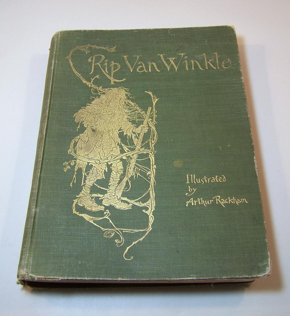
Over the past month I've been working on book design. I've been researching a number of different elements. Last week I looked at old children's books dating back 100's of years courtesy of the MMU's special collection. One gem I found in there was Rip Van Winkle illustrated by Arthur Rackham.

Rackham has always been one of my favourite illustrators so it was enlightening to see all of the plates rather than the select few images you find in art books.

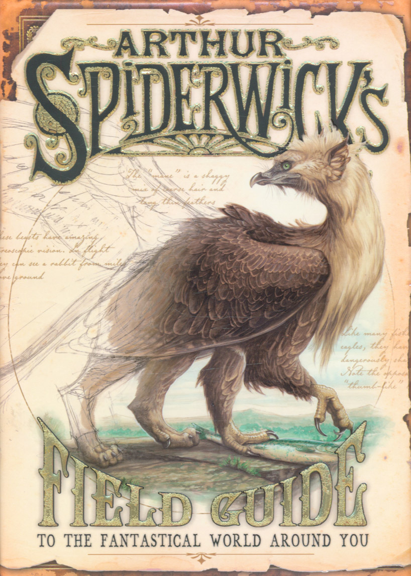
The design for, Tooth and Nail,' will be more of a tip of the hat to, 'Arthur Spiderwick's Field Guide: To the Fantastic World Around You.' This really is a beautifully designed book with great attention to detail and illustrated by Tony Diterlizzi. This is why I keep referring back to it again and again.


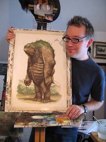
For more of Tony Diterlizzi's work check out his site.

Thursday, 30 May 2013

Square Comics

I've been frantically completing sample pages for,  'Tooth and Nail'. One of the decisions I made quite early on was to go for a square page . This is unusual for comics yet quite common in children's picture books. When it comes to laying out your page it throws up some challenges compared to a conventional  comics page. Some of my layouts weren't working as well as I'd have liked and a lot of solutions used your typical comic don't quite work.

I got some advice from Dan Berry and he suggested using a grid to figure out how to best use and layout the page. This worked wonders and solved the majority of the problems I was having. A couple of weeks back I resolved my media and am pleased with the result.

SO! After working none stop for a couple of months I gave myself a couple of days off. I popped down to my local comics shop and browsing for some inspiration found not one but two square comics sat happily staring at me from the shelf.


Both were a great read and I will be hunting down the rest as I came in a little late to both series. As far as the panel layouts go, I will be stealing from both of them. It's great trying something new and a real comfort when you find others are exploring similar territory. Here's to the square comic!

If your interested Davis Petersen creator of, 'Mouse Guard' has and interesting post here about the square comics format. I wish I'd seen that 3 months ago. Aieee!


Thursday, 7 March 2013

Make It Then Tell Everybody


I spent last week working away to pod-casts at http://makeitthentelleverybody.com/ . They are excellent! Most of it is informative discussion about the process of making comics. The rest of it is just plain hilarious.
All interviews are by Dan Berry who has an informal approach and is very good at teasing information out of his interviewees. I've run out now because they are that good. I had a good old binge on pod-cast but now I have nothing left to listen too. Noooooo!!!

Thursday, 13 December 2012

Something About Pirates

Quetsion: When is comic book not a comic book?
Answer:   When it's a picture book that is at heart a comic book? Hmmm!

I've been temping at a book shop over Christmas. I thought it would be a great opportunity to see how books are sold, who buys them and whether kids are there and influence the purchase. I've spent most of my time at the till so I've not seen much of the selection process, just the result, (Boo! Hoo!). The Pirate-Cruncher and The Pirates Next Door, passed me by during the day and I immediately recognised the artwork. Later I caught sight of the authors name and it was none other than author/artist Jonny Duddle. This set bells ringing and after work I put my generous staff discount to good use and bought both of his books.

Both of Jonny Duddle's picture books are exceptional and they are a great introduction to comic book language for children aged 4 -7 (and older). It is a blend of traditional picture book and comic book using panels and speech bubbles to assist in delivery of an exciting narrative. I thought it was a great blend of the two media and I'll be doing some of this in Tooth and Nail.

I was first introduced to Jonny's tips, tricks and skills as an illustrator in ImagineFX . I really like his style which is why I had to purchase both books and why I am eagerly awaiting The King of Space.  I'll be following it's progress very closely. Oh and his latest book The Pirates Next Door, has been winning all sorts of awards and prizes.

Friday, 7 December 2012

Korgi

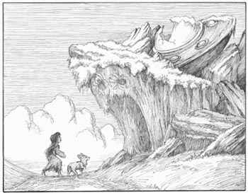
Over the past few weeks I've been looking at the complexity of panel layout within children's comics and graphics novels. I found a real gem in Korgi Book 1 by Christian Slade. Its an all ages graphic novel told exclusively through image. I confess I would never have picked it up if it were not for research purposes, wink, wink,  but thankfully I did.


Christian's line work and composition are fantastic. What he excels at is his use of parallel lines to describe form and movement. This adds a real energy to every page. Nothing feels dead or static. More uniquely and more importantly to comics is his use of this technique to guide your eyes in reading the panels and moving your eye to the focal point within a frame or page. I have not seen this done before in comics in this way and found it quite exciting and fun. The pacing of the book is great as well. There's a full review here.

As mentioned previously I've been looking at some DFC strips compiled for graphic novels. I've also been reading Marvel's, The Wonderful Wizard of Oz.What they all have in common is very simple panel layout. This is quite different to graphic novels aimed at a more mature comic reading audience. It's less playful and inventive but when it comes to communicating a story directly and with absolute clarity, quiet panel layout really cannot be beaten.